
🦆 Interaction Nerds by UXA
This week from Archive & Collection: upcoming FigNight, how typography aids people with special needs, and a new font for your next web design!
👋 Announcements — Exploring Typography & Readability and FigNight!
Happy third week of school! In this issue, we will learn about how typography is used to create a better reading experience for people with autism and a typeface called Manrope, a font made specifically for modern and minimalistic web designs. ✍️
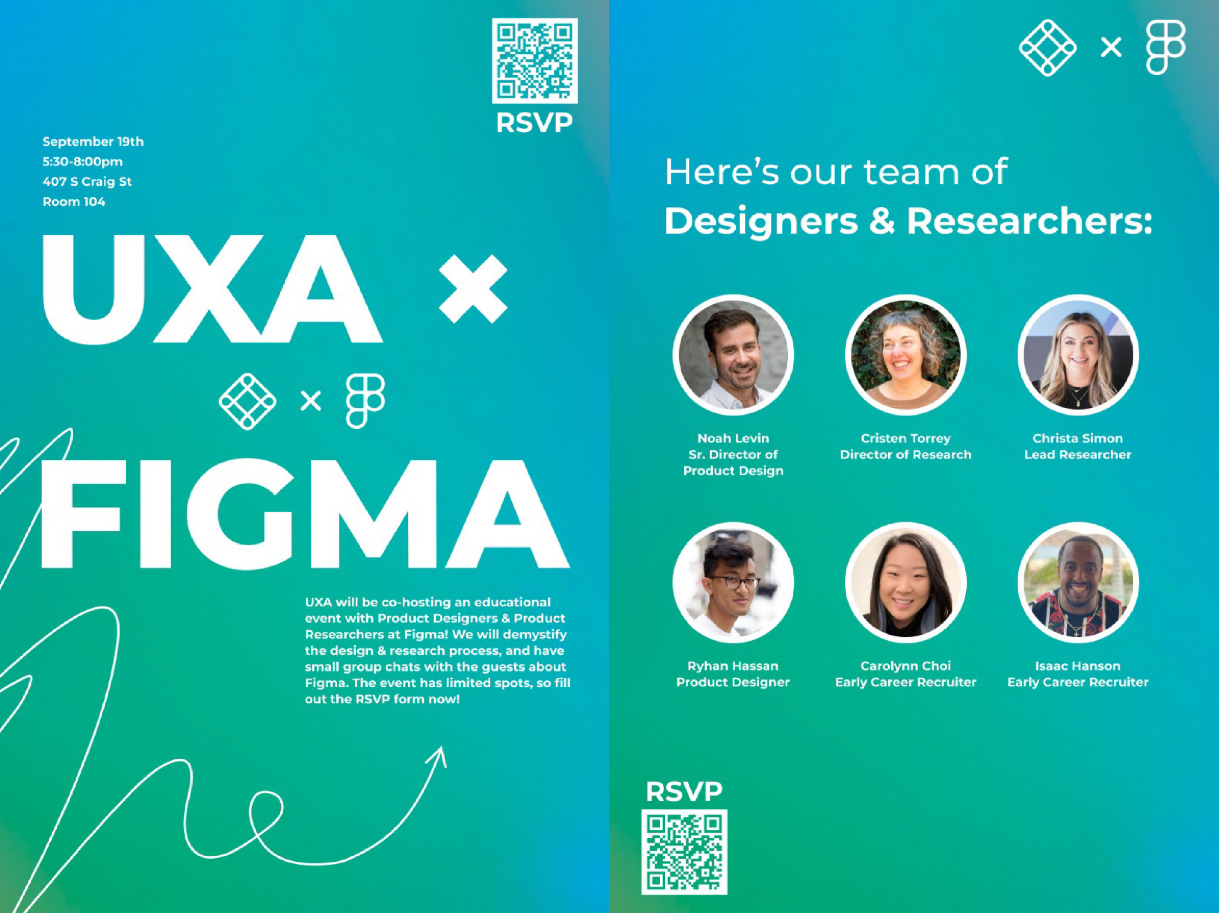
Also, we are excited to announce that UXA will be co-hosting an educational event with Product Designers & Product Researchers @Figma on Monday, Sept. 19, from 5:30 - 8:00 PM! 😆
Together, we will demystify the design and research process with Figma designers and researchers, and have small group chats with the guests to have a glance at the work and life at Figma! If you’re curious about what it is like to work at Figma or what unique experiences Figma practitioners have, you definitely want to mark this event on your calendar! 🗓
We only have 70 slots reserved for the event, so please fill out this RSVP form to reserve your chance to learn more about Figma and UX! 🙌
🌱 Reading Corner — Accessible Typefaces for Everyone
When you choose a font for your designs, what is a criterion that pops into your mind first? Many people may say “readability,” but something that may be readable for most people may not be truly accessible to everyone. In this paper, researchers investigated how typography can be used to improve educational practices for autistic students.

🍄 Side Notes — Manrope : A Modern Sans-Serif for Everyone
If you go to a random website, we can guarantee you that 7 out of 10 websites use Inter as their typeface. Carefully crafted and known for its high readability, Inter became the most popular web font since its release in late 2016.
Font is one of the easiest ways to change the aesthetic feeling of web designs. If you wish to explore a unique aesthetic direction, Manrope would be a cool font to check out!

Manrope is a crossbreed of several different font types: semi-condensed, semi-rounded, semi-geometric, semi-din, and semi-grotesque. It is context-sensitive for upper/lower case letters and apostrophes, and it allows you to create custom ligatures.

Here is a side-by-side comparison of Inter and Manrope:

🙋 One Question for You
This week’s question:
If money is not an issue, what do you think your job would be?
As always, you can reply directly to this Substack email, sent the response through this form, or send the response to yizes@andrew.cmu.edu 😊.
Last week’s question:
What do you usually have when you don't have the time to cook (Hunan Express? Chipotle?)
Sean:
Chipotle is usually what I go with, online ordering + pick up just makes it so much easier lol
Rebecca:
This might be a controversial place but I love Sushifuku!! Their rainbow roll is really good🤤 and usually they are pretty quick so it saves time
Caleb:
I’m a fan of Rosetea, their portions are usually big enough for two meals 💪
Sophie:
The Exchange or ABP!
🤔 Who’s behind the scenes?
Thanks for reading this week’s Interaction Nerds by CMU UXA! The editors behind this work are Sean Shen, Emily Amspoker, and Rebecca Jiang.
🥰 Follow Us
We look forward to co-curating future content with you! Let us know how you think about the content and send us some good vibes through these channels below.
Instagram | Facebook | Linkedin | UXA Website
🌱 Join the Community
Join the Slack channel to get updates on upcoming events, learn about cool resources and opportunities, ask questions about anything HCI, and much more.