


🦆 Interaction Nerds by UXA | F23.12
UX Beyond the Screen: HCI Capstone, UX through a Healthcare Lens, UX Problems at CMU, GIFs for Portfolios, To Push or Pull? Opening the "Norman" Door of UX
👋 Announcements — Fam Olympics & Career Prep Day!
Come one, come all to not one but TWO exciting events this week! We’re finishing the semester with a bang 💥.
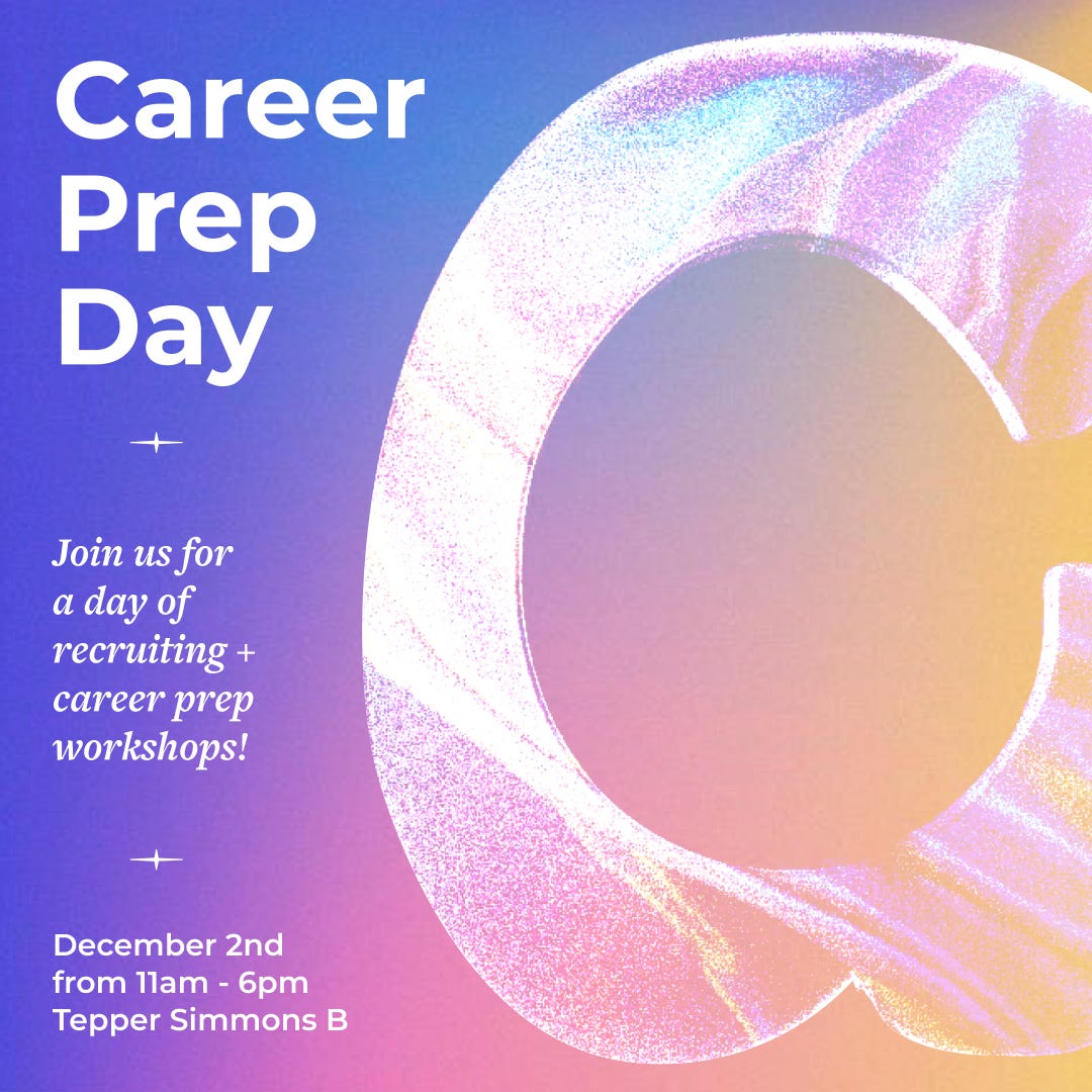
Wanna learn more about UX design and research recruiting? Come to Career Prep Day this Saturday 11am-6pm in Tepper Simmons B (pop by for however short or long you can). We’ll have a day filled with networking, food, portfolio and interview prep with designers from Amazon, Google, Epic Games, and Kikoff.
We’ll also have a live Portfolio Review Session! Fill out this form to get your portfolio reviewed.
Stay for networking, career prep, and to enjoy complimentary boba 🧋 from Tsoacaa :)
Forms will close on Wednesday, November 29 11:59pm.

Come have a blast at UXA Family Olympics tomorrow 5-6pm in Tepper Simmons A, with an exciting lineup of mini challenges, fantastic prizes, and a whole lot of fun awaiting you and your family! If you don’t have a family, that’s okay - we’d love to see you there!
🍎 Campus Compass — 05-571 Undergraduate Project in HCI
Written & edited by: 😈 Sophie McGrady
💼 How are the skills learned in your HCI courses used in the industry? How can you practice designing with real stakeholders that may have changing needs and goals? 05-571 Undergraduate Project in HCI aims to help students practice just that. Read on to see how students use their HCI skills to design and implement a working software application for client stakeholders!

🤔 What is Undergraduate Project in HCI?
This course is the Capstone for HCI undergraduates, allowing students to learn by doing. Students are put into multidisciplinary teams, then paired with CMU-based clients (e.g. SCS Computing Services, IDeATe’s Physical Computing Lab) or external clients (e.g. SpectraGenetics, Noteful) to work towards goals defined by the team and client.
🧐 What do you do in Undergraduate Project in HCI?
The semester is separated into different phases: research, lo-fi prototype, mid-fi prototype, and hi-fi prototype. Within the research phase, teams conduct user research to inform design decisions. The lo-fi, mid-fi, and high-fi prototype phases allow teams to iteratively test and create their designs as they work towards building a software application that can be used by their client and presented to the class at the end of the semester.
😯 Who should take Undergraduate Project in HCI?
Undergraduates working towards a BS in HCI or an Additional Major in HCI are required to take Undergraduate Project in HCI. Before taking this course, you must have taken one of the following: 05-410, 05-430, 05-631, 05-610, 05-630, 05-431.
🌀 Interview — UX Design Through A Healthcare Lens
Written & edited by: 🧸 Ahana Banerjee
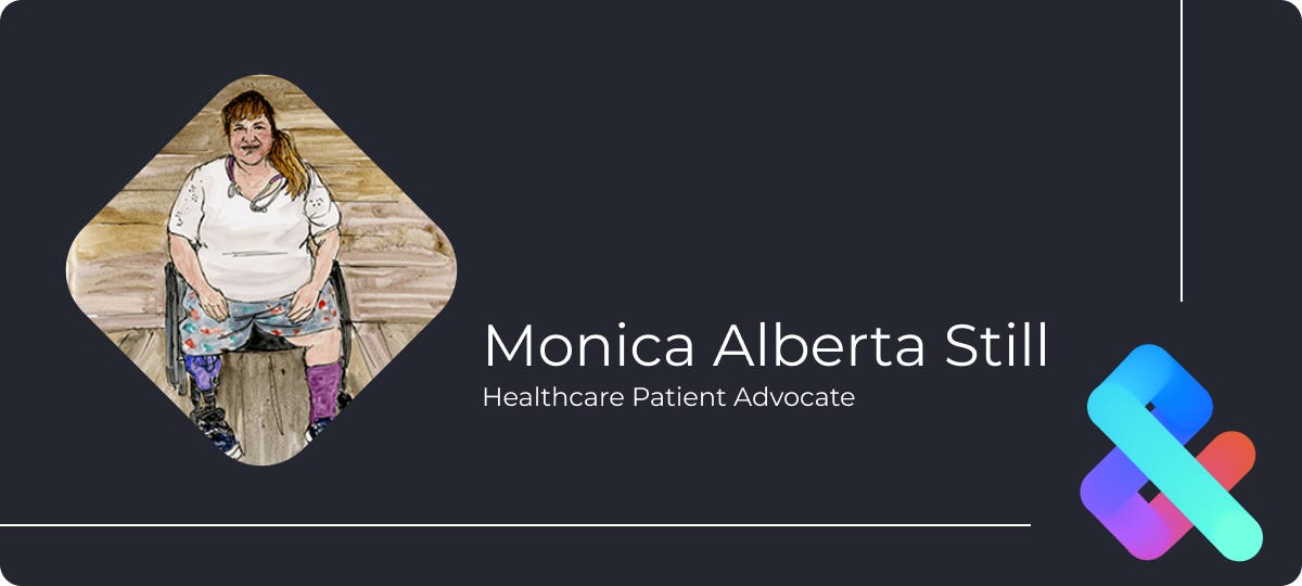
Monica Albert Still has over 30 years of home care experience specializing in performance improvement and regulatory issues. She is committed to working towards the equity for disabled people in the healthcare system.
Currently, Monica is focused on patient advocacy, making sure their voice is heard and listened to. Her narrative serves as a reminder that the principles of design have tangible implications in healthcare and broader societal accessibility contexts.
🍀 Editor’s Pick — UX Problems at CMU
Written & edited by: 🥸 Kaitlyn Ng

🍉 While UX usually resides in digital spaces, it’s actually all around us, specifically all around CMU! Read this week’s Editor’s Pick to learn about prevalent UX problems on campus and possible solutions to these problems. How many have you experienced?
🎯 Resource — Recording GIFs of prototypes for your portfolio
Written & edited by: 🚐 Sherry Chen
Are you working on your portfolio? Do you need to record prototypes for your website? Use Dropbox Capture to record GIFs.
Mac
1. Go to https://www.dropbox.com/capture
2. Click download for macOS Intel or scroll down for macOS Silicon if you have the M1, M2, or M3 Chips

Windows
1. Go to https://www.dropbox.com/capture
2. Click download for Windows

🙈 Fun - To Push or Pull? Opening the “Norman Door” of UX
Written & edited by: 🍳 Evelyn Lui

😱 Here’s a common experience shared by pretty much everyone in modern society: accidentally pushing a pull door, or even worse, pulling a push door.
It’s pretty much a recurring nightmare for me. As I walk up to the ambiguous door, my mind races to solve the guessing game inside my head: to push or to pull? What usually follows is the sad thump of the door as it refuses to budge against my futile efforts. Over the years I’ve learned to maintain my outward composure, but I still internally wince when there is someone nearby to witness the tragedy.
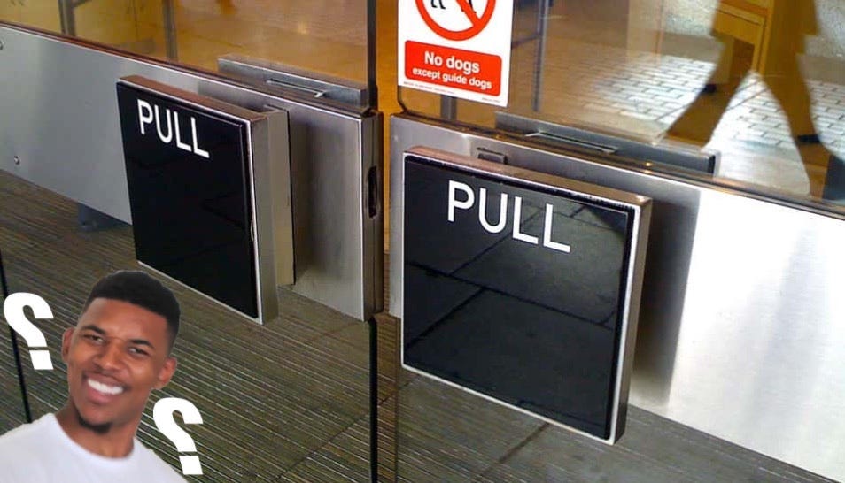
So what is the cause behind my (and a lot of other people’s) door-related suffering? 🤨
Situations that create a Norman Door—poorly designed products that are confusing to use—often happen when designers prioritize form over function. In an ideal world, products don’t need instructions or labels since how to interact with the product should be obvious from the get-go. This can be done through the use of affordance, a design concept coined by psychologist James Gibson.
“Affordances provide strong clues to the operations of things. Plates are for pushing. Knobs are for turning. Slots are for inserting things into. Balls are for throwing or bouncing. When affordances are taken advantage of, the user knows what to do just by looking: no picture, label, or instruction needed.”
- Donald Norman, “The Design of Everyday Things” 📖
Affordance is applicable to all products! For doors, affordance can mean a round knob for turning, a vertical and slim bar for pulling, or a flat panel for pushing. Generally, affordance can be a combination of the perceived and actual properties of an object.
Types of affordances
Perceptible: obvious characteristics that indicate to users what the possible and desired actions are. Back to the Norman Door, a flat panel at the handle position hints to users to push much more so than a bar handle.
Hidden: less perceptible cues that often require experience or trial-and-error to discover. One example of this affordance is drop-down menus, which won’t appear until users hover over it.
False: misleading affordances that suggest to users they can do something that is not possible. A text that is underlined yet leads to no link is one such example.

How do we design better affordances?
Our goal is to minimize user error and cognitive error! We can achieve this through the following:
🤔 Understand users through UX research - understanding how users anticipate affordances will lead to better designs that provide better clues and usability
🛑 Follow conventions that are commonly recognized - e.g., putting “search” in search boxes or using red as a warning/stop signal
🔍 Logical design principles - clear affordances without clutter are crucial to guiding a user’s interaction with the application
💻 Using material design - when possible, take advantage of natural motions and cue-rich features that are intuitive to users.
🗨️ Can you recall any Norman Doors around CMU’s campus? Bonus points if you can think of more than three!
🤔 Who’s behind the scenes?
The editors behind this week’s issue are 🥸 Kaitlyn Ng, 😈 Sophie McGrady, 🧸 Ahana Banerjee, 🕺 Arin Pantja, 🍳 Evelyn Lui, 🚐 Sherry Chen, 🐳 Alana Wu, and 🦝 Caleb Sun.
🥰 Follow Us
We look forward to co-curating future content with you! Let us know what you think about the content and send us some good vibes through these channels below.
Instagram | Facebook | Linkedin | UXA Website
🌱 Join the Community
Join the Slack channel to get updates on upcoming events, learn about cool resources and opportunities, ask questions about anything HCI, and much more.